


I call shenanigans! Dimension Data rolled out in this jersey (below) at some early season Australian rides, giving the impression that the UCI had gotten it wrong with the image above:
Then at the Tour Down Under presentation removed black jackets based on the black design to reveal:

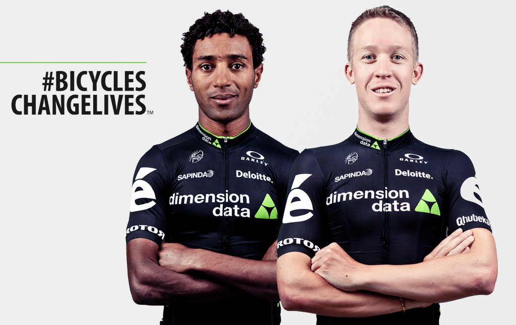
As for the actual designs-obviously the biggest departure is the loss of stripes and MTN from Dimension Data and increased white. AG2R go with well-it-kind-of-is-broken-and-has-been-for-a-long-time-but-we-still-won't-fix-it by changing the brown on the left shoulder with blue. To be fair their jersey has never really been the issue-it is when they combine it with the brown shorts that the cycling world sighs. Would keeping the maillot design and switching to the blue bibs be such a bad idea? Cannondale join other teams in reversing the trend for more black on kit by upping the green, while still keeping the argyle. I feel that the Garmin kit is still one of the classics-so much so I wear the hoodie to this very day (well maybe not this very day today since I now have that lovely coat my wife bought me..) and I find it very hard to decide whether or not I actually like the Cannondale jersey. Would I buy it if it popped up on a Sport Pursuit sale for example?I don't think I would. That isn't to say it is a bad design-it just lacks something I can't put my finger on. (I am also aware that this is in danger of turning into a fashion blog so I will avoid that temptation and cut off the inevitable bores who start quoting The Rules. ) When we are out on our bikes, we wear kit. What is wrong with wearing kit that pays tribute to those who hammer over the cobbles of Paris-Roubaix, suffer up the Galibier or bust themselves in small races that don't even have their own Twitter feed, never mind TV coverage, all for our entertainment? I will return to this topic in a future post.


So after last year's little disagreement with the UCI over their initial design IAM seems a bit less controversial this time around. There was a fear when pics of the 2016 jersey surfaced that more white shorts could be going transparent in the rain (trust me-I have seen this happening to riders ahead of me in the group and there is no greater incentive to take longer turns on the front). However when we eventually got to see full shots it turns out they are sticking with last year's bibs with extra colour blocks. Again a jersey that should make it easier to spot IAM in the bunch.
Plus ça change
Some teams are sticking with the tried and tested with just slight variations this season. Movistar have more or less stayed the same except for a white patch on the back pockets.

Lotto NL- Jumbo also went for the adding more white to an existing design option:

And as for all-white- FDJ have stuck with the same kit which I feel is a shame since I really loved the blue 2014 one. Let's hope the World Tour soigneurs buy shares in washing powder before the season starts.
Astana, Tinkoff, Trek (now Trek-Segafredo), Lotto-Soudal and Lampre-Merida will also make the game of guessing what year race photos were taken that bit more difficult by more or less sticking with what they have been using this year. There are a few detailing changes but generally, apart from some different sponsors names, their teams will look very familar in 2016.
We are still waiting for Giant Alpecin, Orica GreenEdge and BMC (though with the latter I am going to stick my neck out and guess it will be a red and black blocky number).
It seems that teams came to the same conclusion many of us did this year- too much black in kits was making identification difficult. However now there is going to be a surfeit of white blocks so those overhead shots could still prove difficult to decipher.
No comments:
Post a Comment